Plotting Racial Inequity In Higher Education with College Scorecard Data

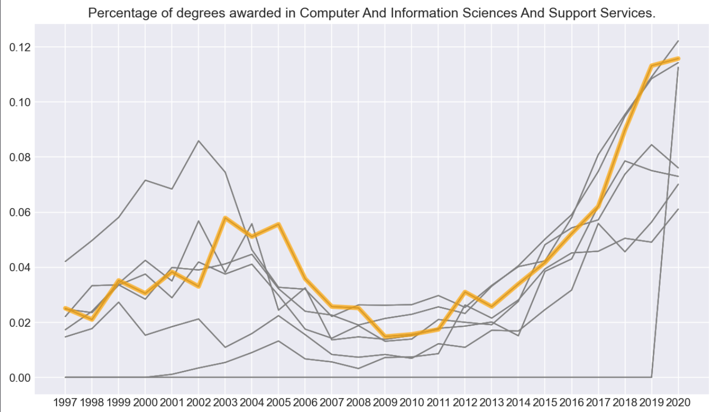
This began with an exploratory data analysis on data provided by the Government College Scorecard. In this analysis I charted the popularity of different majors across the Ivy’s from 1998-2019, using Python with Pandas and Matplotlib in a Jupyter notebook—in fact this was one of my first explorations with python.
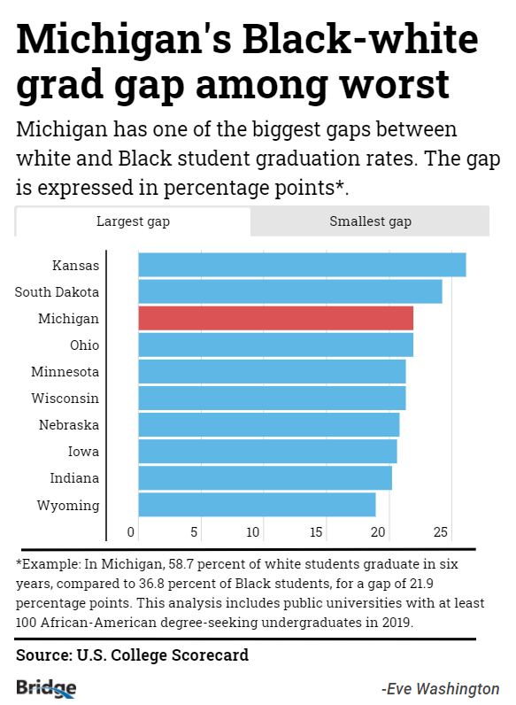
I didn’t produce anything with this exploration until a year later, while I was working with Bridge Michigan, when I picked it up again while working on the Higher Education beat. Using the same methods I modified my code to look at graduation rates by race, and interviewed a plethora of experts in this field.
See the story here


